Logo Design Fundamentals: From Concept to Final Design
Luki
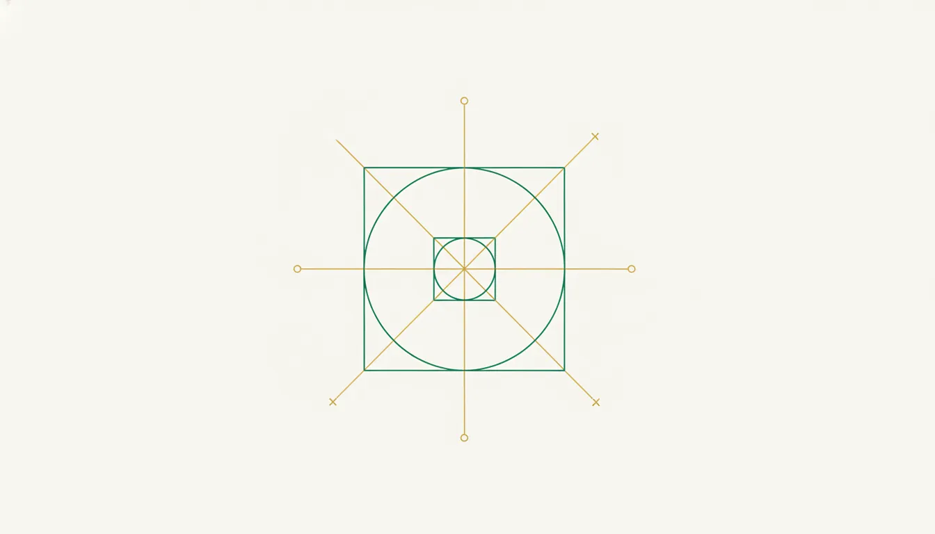
A strong logo is the single most concentrated piece of communication a brand ever creates. It needs to work at 16 pixels on a browser tab and at 16 feet on a billboard. It needs to feel instantly recognizable after a single exposure and still hold up after a decade of daily use. That is an extraordinary amount of pressure on one small graphic — and understanding the fundamentals behind effective logo design is the only reliable way to handle it.
This guide walks through the core principles that separate forgettable marks from iconic ones: typography, color theory, composition, negative space, scalability, and the golden ratio. Then it covers the practical process of turning a concept into a finished logo design, including how modern AI logo design generators have collapsed timelines from weeks to minutes.
The Five Types of Logo
Before touching a single tool, you need to decide on the structural category of your mark. Each logo type carries different strengths, and choosing the wrong one creates friction that no amount of polish can fix.
| Logo Type | What It Is | Famous Examples | Best For |
|---|---|---|---|
| Wordmark | The brand name in a custom or carefully chosen typeface | Google, Coca-Cola, FedEx | Brands with short, distinctive names |
| Lettermark | Initials or an acronym rendered typographically | IBM, HBO, NASA | Long company names that need abbreviation |
| Pictorial mark | A recognizable real-world object, simplified | Apple, Twitter (the bird), Target | Established brands that can stand alone without text |
| Abstract mark | A geometric or organic shape with no literal meaning | Nike Swoosh, Pepsi, Airbnb | Brands wanting a unique, ownable symbol |
| Emblem | Text enclosed within a symbol or badge shape | Starbucks, Harley-Davidson, NFL | Heritage brands, universities, organizations |
Many successful brands use combination marks — a wordmark paired with a symbol — during their early years, then drop the wordmark once recognition is established. Think of how Starbucks gradually removed “Starbucks Coffee” from their circular emblem over successive redesigns.
Typography: The Backbone of Logo Design
Typography accounts for roughly 70% of the visual weight in most logos. Even purely pictorial marks like Apple’s bitten apple exist alongside a wordmark in most real-world applications. Getting typography right is non-negotiable.
Serif vs. Sans-Serif
Serif typefaces (those with small strokes at the ends of letterforms) signal tradition, authority, and editorial credibility. Think of the logos for Vogue, Tiffany & Co., or The New York Times. Sans-serif typefaces — clean, stroke-free — communicate modernity, accessibility, and technical precision. Google’s switch from serif to sans-serif in 2015 was a deliberate signal: we are a technology company, not a library.
Custom Lettering vs. Existing Fonts
The most enduring wordmarks use custom lettering, not off-the-shelf fonts. Coca-Cola’s Spencerian script was hand-drawn in 1887. FedEx’s wordmark uses modified Futura Bold with a carefully crafted negative-space arrow between the “E” and “x.” Even Google’s apparently simple wordmark uses a custom geometric sans that subtly differs from any publicly available font.
For early-stage brands, modifying an existing typeface — adjusting kerning, customizing specific letterforms, or splicing elements from two fonts — delivers 80% of the distinctiveness at 20% of the cost of fully custom type design.
Key Logo Design Tips for Typography
- Limit yourself to one typeface in the logo itself. Two at absolute most (e.g., a wordmark plus a tagline in a contrasting weight).
- Adjust kerning manually. Automatic letter-spacing almost always needs refinement, especially around letters like “T,” “V,” “W,” and “A” that create awkward visual gaps.
- Test at small sizes. Thin strokes, tight counters (the enclosed spaces inside letters like “e” and “a”), and decorative details collapse at 12px. If your typography breaks at favicon size, it needs simplification.
Color Theory in Logo Design
Color is the first thing the brain processes — before shape, before text. Research from the Institute for Color Research found that people make a subconscious judgment about a product within 90 seconds, and up to 90% of that judgment is based on color alone.
The Psychology Shorthand
- Blue — Trust, stability, professionalism. Dominant in finance (Chase, PayPal) and technology (IBM, Intel, Dell).
- Red — Energy, urgency, appetite. Used by food brands (Coca-Cola, McDonald’s) and media (Netflix, YouTube).
- Black — Luxury, sophistication, authority. Fashion and premium brands (Chanel, Nike, Apple).
- Green — Growth, health, nature. Environment and wellness brands (Whole Foods, Spotify).
- Yellow/Orange — Optimism, warmth, accessibility. Friendly consumer brands (IKEA, Amazon, Mastercard).
Practical Color Principles
Start in black and white. If your logo design doesn’t work in pure monochrome, no color palette will save it. Color should enhance a strong form, not compensate for a weak one.
Limit your palette. One to two colors for the primary mark, with a possible accent. The most recognized logos in the world — Nike, Apple, McDonald’s — work with a single color.
Check contrast ratios. Your logo will appear on white backgrounds, dark backgrounds, photographs, and merchandise. Ensure sufficient contrast in every context. A logo that only works on white is only half-designed.
Consider cultural context. White symbolizes purity in Western cultures and mourning in many East Asian cultures. Red means luck in China and danger in the West. If your brand operates globally, research color associations in your target markets.
Composition, Balance, and the Golden Ratio
Great logo design is fundamentally an exercise in visual balance. The viewer’s eye should settle naturally into the mark without feeling pulled in any single direction — unless that tension is deliberate and purposeful.
Symmetry and Asymmetry
Symmetrical logos (Toyota, Volkswagen, Target) project stability and order. Asymmetrical logos (Nike, Spotify) create movement and energy. Neither is inherently better — the choice should reflect brand personality. A financial institution probably wants symmetrical stability. A music streaming service benefits from a sense of forward motion.
The Golden Ratio (1:1.618)
The golden ratio appears throughout nature — in nautilus shells, sunflower seed patterns, and human facial proportions. In logo design, it provides a mathematically harmonious framework for proportioning elements.
Apple’s logo famously aligns with golden-ratio circles. The Twitter bird was constructed entirely from overlapping circles whose diameters follow the Fibonacci sequence. The Pepsi logo redesign used golden-ratio proportions to determine the relationship between the red, white, and blue sections.
You don’t need to be slavish about it — the golden ratio is a guide, not a law. But when you’re struggling with proportions that feel “off,” overlaying a golden-ratio grid often reveals exactly what needs adjusting.
Grid Systems
Professional logo designers typically work on a grid. The grid doesn’t constrain creativity — it provides a scaffold that ensures optical consistency. Consistent stroke widths, uniform corner radii, and aligned anchor points all emerge from disciplined grid usage. Google’s Material Design icons, for example, are built on a 24px grid with specific keyline shapes (circle, square, rectangle) that guarantee visual consistency across hundreds of icons.
Negative Space: The Expert’s Advantage
Negative space — the empty area around and between elements — is where good logo design becomes great logo design. Beginners fill every available pixel. Experts know that what you leave out communicates as powerfully as what you include.
The FedEx arrow is the textbook example: an arrow formed entirely by the white space between the “E” and “x.” It communicates speed and precision without adding a single extra element. The arrow is invisible until someone points it out, and then you can never unsee it — that is the mark of masterful negative-space usage.
Other notable examples:
- NBC peacock — The negative space between the colored feathers forms the peacock’s body.
- Guild of Food Writers — A spoon shape emerges from the white space between a pen nib’s tines.
- Spartan Golf Club — The space between a golfer’s swing and body forms a Spartan helmet.
When evaluating your own logo design, squint at it. What shapes emerge from the spaces between elements? Are they clean and intentional, or chaotic and accidental? Clean negative space is a signal of professional-grade work.
Scalability: Design Once, Deploy Everywhere
A logo that looks stunning at 400px wide but turns into an unreadable smudge at 32px is not a finished logo. Scalability is one of the most important logo design principles, and it requires deliberate attention.
The Scalability Checklist
- Test at extremes. Render your logo at 16px (favicon), 32px (mobile nav), 200px (website header), and 2000px (print/billboard). If any version fails, rework the design.
- Create responsive variants. Many modern brands maintain two or three versions: a full lockup (symbol + wordmark) for large applications, a compact symbol-only version for small spaces, and sometimes a simplified version with reduced detail for the smallest sizes.
- Avoid fine details that vanish. Thin strokes, small text, subtle gradients, and intricate patterns all collapse at small sizes. If a detail doesn’t survive at 32px, question whether it belongs in the logo at all.
- Design in vector. Always. Raster logos (PNG, JPEG) degrade when scaled. Vector formats (SVG, AI, EPS) scale infinitely without quality loss. This is a non-negotiable logo design principle.
Mastercard’s 2016 redesign is a case study in scalability-driven simplification. They removed the company name from the overlapping circles, because the two-circle symbol was already recognizable enough to stand alone — and it performed dramatically better at small sizes without text competing for space.
The Logo Design Process: Brief to Final
Understanding how to design a logo as a process — rather than a single creative leap — is what separates professional results from amateur ones. Here is the workflow that working designers follow:
1. The Creative Brief
Every strong logo starts with questions, not sketches. What does the brand stand for? Who is the audience? What three adjectives should the logo evoke? Who are the competitors, and how do we differentiate? What applications will the logo appear on (digital only, print, merchandise, signage)?
A thorough brief prevents the most expensive mistake in logo design: creating something beautiful that communicates the wrong message.
2. Research and Moodboarding
Before generating ideas, study the landscape. Collect competitor logos to understand visual conventions in the industry (so you can either align with or deliberately break them). Build a moodboard of typography, color palettes, textures, and reference marks that evoke the target feeling.
3. Sketching and Concept Exploration
Start loose. Pen and paper, not software. Generate 20-30 rough concepts exploring different directions: wordmark variations, symbol ideas, monogram options, abstract approaches. Quantity matters at this stage — the first ideas are usually the most obvious ones, and breakthrough concepts tend to emerge around sketch 15-25.
4. Digital Refinement
Take the three to five strongest concepts into vector software. Refine shapes, test typography pairings, experiment with color. This is where grid alignment, golden-ratio proportioning, and negative-space refinement happen. Expect to go through 10-20 iterations per concept.
5. Testing and Validation
Place your finalists in real-world mockups: business cards, website headers, app icons, social media avatars, email signatures. A logo that looked perfect on a white artboard often reveals problems in context. Test across light and dark backgrounds. Test at small and large sizes. Test in monochrome.
6. Finalization and Delivery
Prepare the final logo in all required formats: SVG for web, high-resolution PNG with transparency, PDF for print, plus any size-specific variants. Document usage guidelines — minimum size, clear space requirements, prohibited modifications — in a simple brand guide.
How AI Logo Design Generators Accelerate the Process
The traditional logo design process described above works. It also takes 2-6 weeks and costs $500-$5,000+ when done by a professional designer. For startups, solo founders, and small businesses operating on tight timelines and tighter budgets, that timeline is often impractical.
AI logo design generators have fundamentally changed the equation. Modern AI tools can generate dozens of professional-quality logo concepts in seconds, based on nothing more than a text description of your brand. Instead of spending days on steps 2-4 (research, sketching, digital refinement), you describe your vision and the AI produces starting points that already incorporate sound design principles — proper typography, balanced composition, appropriate color relationships.
This does not replace design knowledge. It amplifies it. A founder who understands the logo design fundamentals in this guide will write better prompts, evaluate AI output more critically, and refine results more effectively than someone approaching the tool blindly. The AI handles the mechanical labor of generating variations. You bring the taste, the brand strategy, and the critical eye.
The practical workflow with an AI logo design generator looks like this:
- Complete your brief — clarify your brand values, audience, and aesthetic direction (everything from step 1 above).
- Describe your vision — translate your brief into a clear prompt. Instead of “make me a logo,” try “a minimal geometric wordmark for a developer tools company, modern sans-serif, cool blue tones, technical and precise.”
- Generate and evaluate — produce multiple variations and evaluate them against the principles in this guide. Does the typography hold up at small sizes? Is the composition balanced? Does the color palette match the brand personality?
- Refine iteratively — adjust your description, regenerate, and narrow down. Each round gets you closer to the mark.
- Finalize — export in the formats you need and start using your logo across applications.
What used to take weeks now takes an afternoon. The quality ceiling is defined not by the tool’s capabilities, but by the clarity of your creative direction — which is exactly why understanding the fundamentals matters.
Putting It All Together
Logo design is the intersection of strategic thinking and visual craft. The fundamentals — typography, color theory, composition, negative space, scalability, and the golden ratio — are not arbitrary rules imposed by design academics. They are patterns that emerge from studying what makes the most effective logos in the world actually work.
Whether you are working with a professional designer, learning the craft yourself, or using an AI logo design generator to accelerate the process, these principles remain constant. Technology changes the speed and cost of execution. It does not change what makes a logo effective.
The best logo you will ever create is one where every element — every curve, every color choice, every proportion — exists for a reason, and nothing is there by accident.
Ready to create your logo?
Describe your brand, get professional logo designs in seconds. Free to start.
Try AI Logo Generator